Although they are not specifically listed in the New Features overview, Oracle APEX 4.1 seems to include some charts enhancements and bug fixes.
Here's an overview of the improvements I found on 4.1.0.00.03 compared to 4.0.2.00.07.
1) Although the Font Settings was there in APEX 4.0, there was not a region display selector for it. That got added now.

2) In the Font Settings the Grid Label was removed. This setting was a carry over of APEX 3.x but became obsolete in APEX 4.0 (more info in this blog post's comment).
3) The Marker select list only becomes visible for Line and Pie charts, for other chart types the marker disappeared. (more info in this blog post's comment)
4) Two new features for Bar and Column charts: Overlay Y-Axis and Sorted Overlay Y-Axis which allows to see the Series behind each other instead of next to each other.
Normal behaviour of a 3D Column chart with three series.
If the Overlay Y-Axis is checked the Series go behind each other.
The Sorted Overlay Y-Axis is especially useful in a 2D Column chart, as if you wouldn't do it one column/bar might be over the other one and you wouldn't see it. If it's sorted the smallest are in front and the biggest columns are at the back. In the above example the green (Womens Series) is behind the red (Mens Series), but as they are a bit transparent and 3D you still see it. If you prefer to see it better you should use the Sorted Overlay Y-Axis too.
5) The overall feel of the Application Builder was improved in APEX 4.1. The Axes Settings for example now disable some fields depending other selections on the page. Also only the features that are useful for the chart you selected should be visible.
6) Issues from APEX 4.0 seem to be all resolved in APEX 4.1: Build Query button, Axes, Gradient, Multiple Series
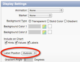
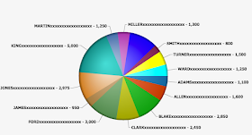
7) You can now position the label of a Pie or Doughnut chart to be either outside (default) or inside. Lengthy labels made the size of the chart smaller as the label was on the outside. If you put your label on the inside you don't have this anymore.
 The chart with the Label Position to Outside:
The chart with the Label Position to Inside:
It's these small tweaks that make APEX even better than it was before and makes it a great development environment.


Thanks Dimitri for the update.
ReplyDeleteWe were very excited to see APEX 4.1
Regards,
Sohil Bhavsar
Hi Dimitri,
ReplyDeletenice work an
d Apex4.1 looks very well but I have a little Problem in Apex 3.2.
I created a 2d- line Chart its complete done, just the Legend font don't looks very well.
I want write "PSTS"
code:
Select null link, (-data-link-) "PSTS"
Apex creat a legend with the return value: Psts.
Is there a possibility to change the the return value in: PSTS ?
Best Regards,
Kyle