This post is part of the Getting Started with Plug-ins Pro APEX plug-ins.
I don't know about you, but I had a love/hate relationship with Interactive Grids in Oracle APEX.
I love it because it's really powerful and very useful and fast to insert, update, and delete multiple records at once. It was also the basis of many new things in APEX linked to modern web development.
But I also disliked it a bit, because to me it felt different than any other component in APEX. Especially in the beginning IGs just didn't work for me. Whenever I wanted to do something, I found myself writing multiple lines of JavaScript. Things have changed, IG is much more stable, and more built-in features have been introduced, and extending it has become easier, or I now have a better understanding of how things work. Today, in every project I do, Interactive Grids are part of it...
Interactive Grids follow the Model View Controller (MVC) model, which is typically used in JavaScript projects. Here's a diagram which shows the (complex) architecture of this component:

John Snyders, one of the architects behind IG, wrote a nice blog post in 2016 which explains Interactive Grids. When you look at John's blog, you will find many more posts about Interactive Grids. He also has an excellent IG cookbook app that shows different use cases of Interactive Grids.
In this blog post, I want to focus on how to represent a status field, I typically call it a flag field. The most common values of such a field are 'Yes' and 'No', 'On' and 'Off', 'Active' and 'Inactive', 'True' and 'False'.
Your native choices in Oracle APEX at the moment of writing are:
- a checkbox
- a radio group
- a switch (which depending the component settings can look like a Switch, Pill Button or Select List)
And here's an animated gif showing how these options look. Changing the first row values from Yes to No and the second row from No from Yes.

The native implementation in APEX is that you have to click in the cell to make it editable, then you see the checkbox, and once selected it shows the display value. When I show those options to my customers, many of them tell me: "Can I not just have a checkbox?" They mean they always want to see the checkbox visible and selected or unselected, like you have with the Row Selector (first column in the IG).
Although Interactive Grids have evolved over the last 4 years, in case you want such a checkbox, it's not as easy as it should be and you need to write custom JavaScript. When the question was asked on Twitter why it wasn't there yet, you see John's reply:

I told Bartosz, who is our lead developer at Plug-ins Pro, that I would love to have an Interactive Grid Checkbox Pro plug-in, to make it very easy to add a "simple checkbox"... but it turned out John was absolutely right... this is not an easy plug-in to do! After multiple iterations, Bartosz finally cracked it and he came back with a checkbox on steroids! 😉
When I think about a checkbox, I don't think about two values, but three:
- null (untouched)
- unchecked (not selected)
- checked (selected)
So, we wanted to give people the choice of what they like: a checkbox with two values or three.
When we discussed the look of a checkbox it turns out that people like the HTML5 checkbox, which personally looks more 'old school' to me, but of course it's very known. But we wanted to give people more choice, so they have full freedom on the look-and-feel of the different states. In some applications it's more intuitive to have a switch look or a check icon or a smiley to name a few.
Here's a quick example of our plug-in in action 😀

Let's move on integrating this awesome checkbox into our Interactive Grid.
The first step is to download and install the plug-in. I covered that in my blog posts Plug-ins Pro: Getting started: Sign-up and install your first Oracle APEX Plug-in. So if you didn't import the Checkbox Pro plug-in yet, read that post first.
Once it's installed it's pretty simple to use the plug-in. Go to a column of the Interactive Grid and change the Type of the column to the United Codes IG Checkbox [Plug-in].

You can customize the look and feel of the plug-in in the Settings area. The Type can be the HTML5 implementation or a checked and not checked icon. So if you want thumbs-up and thumbs-down, or you want a square and checkbox, you name it, you are free to define the icon of your choice.
Next, you define the value it should have when checked and not checked and whether you want to see an empty column or the not checked value when you add a new row.
Finally, you can define if you want to see a title on hover and if people should be able to click the checkbox in the read mode of the IG or only when Edit mode is on (which is default IG behaviour).
The last bit is really what makes this checkbox such a nice user experience. People don't have to be in the cell first to change the checkbox or icon! You don't hear or see my body language when I tell you that sentence, but I'm super excited (!) about this feature! The edit and read mode of the IG, made this plug-in so hard to make.
Events
What is really cool about this plug-in, it's not just a visual checkbox, but it also behaves like a native item and column in APEX. So if you want to dynamically set the value of the checkbox, the plug-in understands that. In the below example, when we change the First name to DIMI, it will set the value of the IS_ACTIVE4 checkbox column.

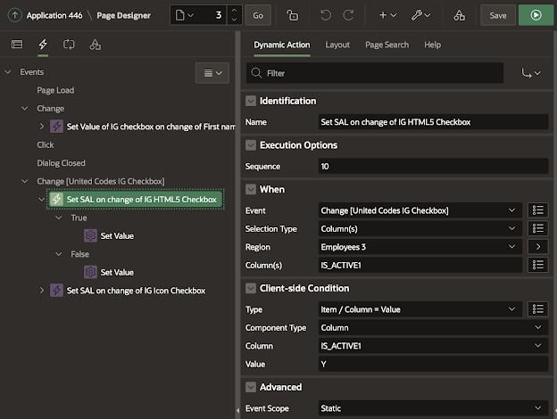
Also when you want to detect a change of the state of the checkbox, you can hook up a dynamic action to that. In the below example, we have a change event on the checkbox on column IS_ACTIVE1 and IS_ACTIVE4. Whenever we change that column (meaning when we check/uncheck the checkbox) the salary will change.
And this is what it looks like:

And there is more...
The checkbox is accessible, supports validations, and you can style it however you want.
And just like any other Plug-ins Pro plug-in, there's extensive documentation and a great sample app that showcases the different features.
You can try the plug-in yourself for 1 month for free in your own APEX applications, so you can see what it can do for you. I also want to highlight that through the end of September 2020, there's a special running. You can find all the details on the Plug-ins Pro website!
I use this plug-in in every Oracle APEX project and I strongly believe anybody using Interactive Grids will benefit from this plug-in! This plug-in works from Oracle APEX 19.2 and above.
Note: depending on when you read this article, the plans are that from Oracle APEX 20.2 a more advanced checkbox item is native available, but it's unclear if it has all of the features our checkbox plug-in has. I will update this post once APEX 20.2 comes out.


3 comments:
Looks very nice.
"but it's unclear if [new APEX checkbox] has all of the features our checkbox plug-in has"
It does not. No custom icons for example. Also no null value.
Going forward you may be interested in some of the upcoming changes to the item API for this and other plugins.
Hi John,
Thanks so much for the feedback.
Looks like our plug-in will still be useful even in APEX 20.2 :)
Dimitri
Hi there Dimitiri,
Curious of your thoughts on a situation. I have a form that currently uses a tabular form, which is no longer available as it is a legacy item in Apex. This is a form that has about 50 questions and we use radio buttons. The benefit is that when completing the form, you only have to click once to make a selection.
In looking at creating a second, similar page, I see that the interactive grid is the next best option as an alternative. The problem though, is that when selecting radio buttons, you have to click twice to choose an option, doubling the time required to complete the task.
Do you know of a way to show multiple radio buttons in the interactive grid vs clicking to select and then choosing one? Or could you recommend an alternative?
My concern also is that in future updates, some legacy options will be removed.
Thank you!
Post a Comment